Overview
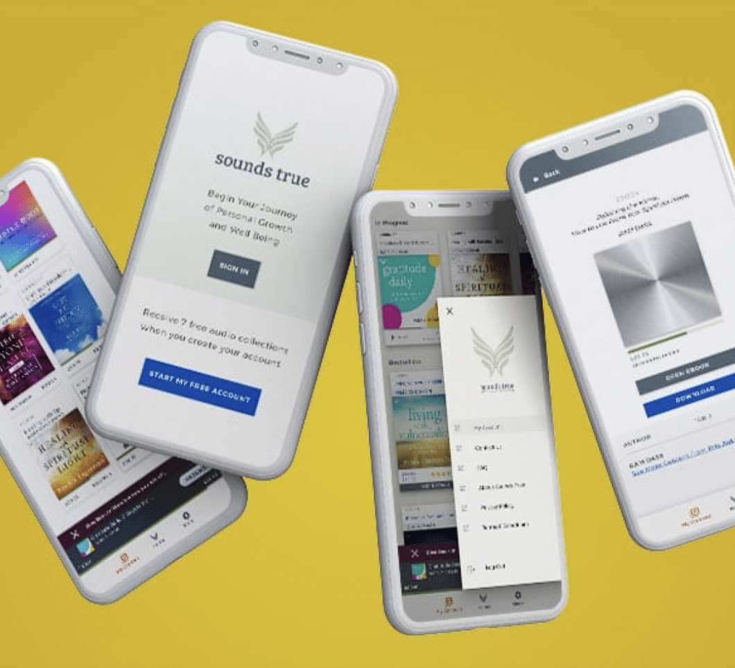
UI Design and Prototype for Sounds True Digital Library App
Based off Material Theme
Multi-Device Design
CLIENT
Sounds True
Boulder, Colorado
Case Study
The Design Challenge:
- The UI needed to reflect current brand guidelines.
- Framework needs to have specific style guidelines integrated into the design system.
- Needs to be based upon Material Theme
- The existing interface needed an ADA accessibility update to WCAG guidelines.
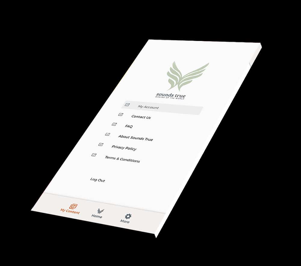
- Navigation components must have the same functionality within a set of web pages are identified consistently (ex. all links look the same, all error messages are red, all action buttons are blue)
- The most important click/tap targets on the site should be at least 38 pixels tall/wide
- All states (default, hover and focus) of active UI must be defined.
- Descriptive text labels must be provided for each form field.
- Colors must meet 3:1 ratio
User Pain Points/Needs
- Ability to download programs to listen offline.
- Ability for tracks to be labeled with names.
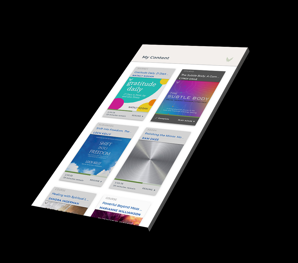
- Ability to be able see all courses in progress.
- User wants to be able to see how much of the course they have completed, and how much time is left (timeline marker).
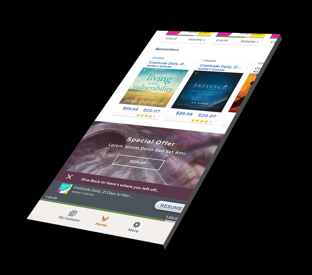
- User wants to be able to see where they left off in their course and jump back in at the same spot.
- User needs to search for and purchase new products in-app that are suggested to them based on an algorithm.
The Design Process
- I developed a high-fidelity prototype with Sketch and InVision after user flows and wireframes had been established, and a style guide to aid further development.


